Over the course of five months, my team of 3 other UX designers aimed to come up with a comprehensive
Our brand is focused on making financial transactions and management easy, fast, and secure. We want to be the go-to app for young professionals who are always on-the-go and want to stay in control of their finances.
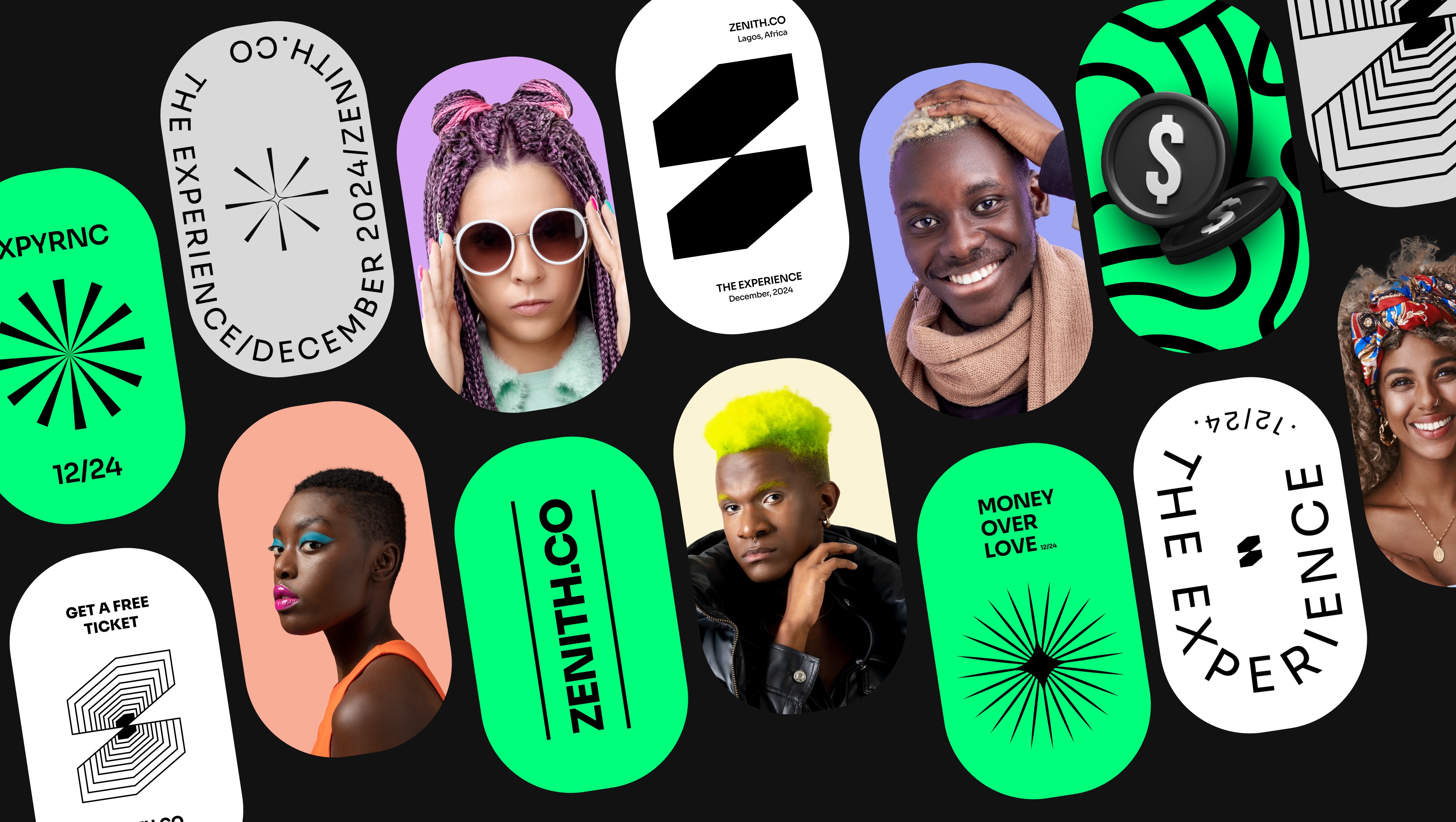
Our brand identity is clean, modern, and tech-savvy, reflecting the simplicity and convenience of our app. The colors should be simple and bold, with a focus on greens, reflecting trust and reliability. The logo should be clean and simple, with a strong, memorable icon that reflects our app's core functionalities.


01
Exploring similar organizations in this space and seeing how they addressed similar challenges
Process:
Landscape reviews of 9 similar organization's websites (6 direct and 3 indirect competitors)
Finding out what users main motivations and goals are while interacting with the website
Process:
Conducted 6 structured user interviews and surveys, moderated user testing on current website
From our Initial Research we learned that
Information must be
scan-able
Users expressed that they had to spend a lot of time finding relevant content on the website
Navigation needs to
be more intuitive
Users were often confused by the jargon/vague page names even if they were returning visitors
Efficient checkout
process neeeded
Users want to check out easily and quickly once they decide to visit the museum
02
Strategy behind our redesign
Exploring different site org. structures that aligned with existing user mental models and made navigation easier
Process:
Card sorting following by 3 rounds of Tree testing where we asked participants to locate items using iterations of our site map.
Iterations based on card sorting and tree testing

Final Site map for an improved navigation and intuitive experience
In our Revised Information Architecture, we
Removed confusing terminology in the navigation menu
Jargon like "Transit kids at home" was replaced with more intuitive naming like "Educational videos"
Encouraged exploration through a discover tab
Workshops & educational resources were shifted to a "discover" tab
Reduced confusion by categorizing events by age instead of type
Eg. Programs for Adults vs Children helped users locate relevant content faster and easier
03
We started out with some quick iterations through paper sketching and lo-fi prototypes on figma
Key Flow 1: Improving discoverability of exhibits
More visuals and white space that allows for quick scanning
Conscious visual design decision to allow for easier scanning to help visitors save time
Nav drop down menu that can handle three levels of page org.
Dropdown menu design that has space for promoted content and/or multiple sub-menu pages
Card format for events & workshops that show just enough info
Only shows critical information to visitors that inform them on relevancy and build curiosity


Key Flow 2: Improving efficiency in the checkout process
Quick select dates (today/tom) based on our user preferences
User research highlighted most visitors plan visits on the day or day before their visit
Progress bar and sticky cart to reduce cognitive load
Reduce confusion/errors by clear indication of their progress and status of any of their inputs
Build awareness with a "don't miss out on" section
Encourage visitors to explore and be more aware all the museums offerings


Reflection
My first project in grad school became a pivotal opportunity to seamlessly apply design thinking and collaborative principles to address a genuine use case. The culmination was presenting the outcomes to the Director of NYTM, making it an exceptionally enriching experience.
If I had more time..
I would have worked on integrating the plan visit flow with the calendar section and spent more time researching how museums set up their search systems
My Biggest Challenge
Overall, it was challenging to arrive at the key problems to tackle as we had to parse through large amounts of content and an un-organized website structure
My Biggest Takeaway
When dealing with a content heavy website, user behavior can reveal interesting work-arounds and priorities which can be great design opportunities