Creating a Design System / Olipop Soda
Creating a Design System /
Olipop Soda
Creating a Design System / Olipop Soda
Project Overview
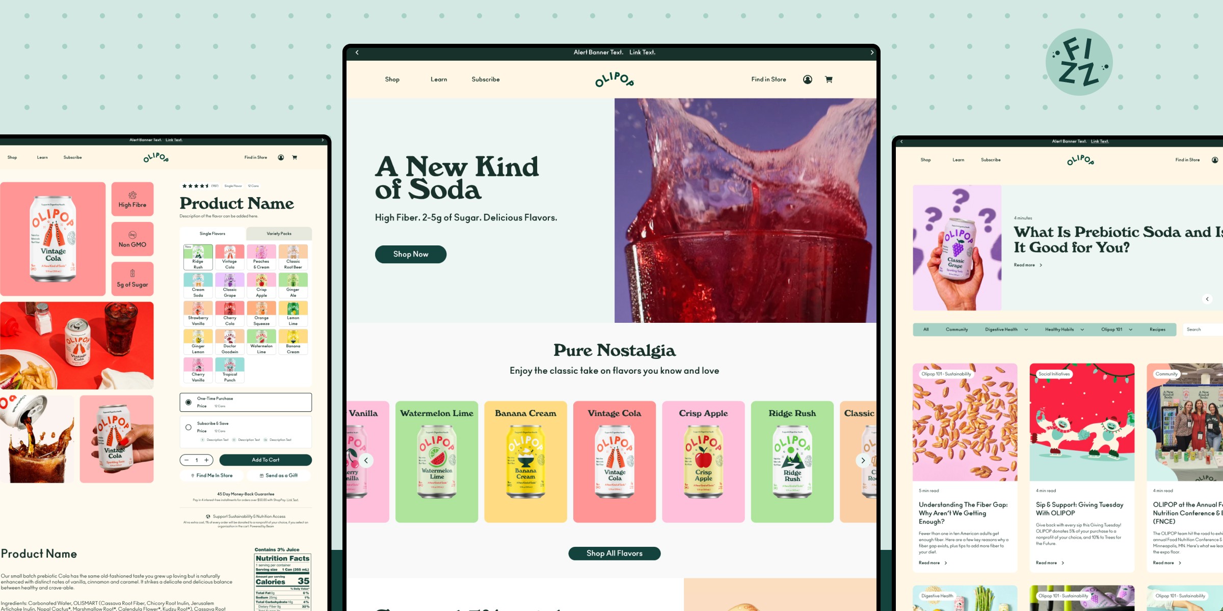
Over two months, our team of 3 UX designers created a comprehensive design system for Olipop, a probiotic soda brand. The goal was to streamline Olipop's design process, improve accessibility of the components and establish a clear and cohesive framework for their digital identity. This was done through a UI library and supporting documentation on Zeroheight.
My Role
Research: Content audit, Accessibility checking
Design: Figma advanced prototyping, brand and pitch decks
Deliver: Design handoff, presentation to mock stakeholders


TL/DR
Project Overview
Project Overview
Project Overview
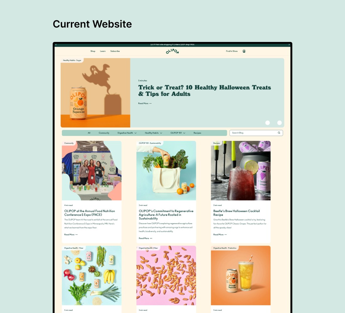
Olipop is a fun and vibrant probiotic soda brand that struggles with inconsistency, usability, and accessibility across its digital assets.
Olipop is a fun and vibrant probiotic soda brand that struggles with inconsistency, usability, and accessibility across its digital assets.
Olipop is a fun and vibrant probiotic soda brand that struggles with inconsistency, usability, and accessibility across its digital assets.
So what did we do?
So what did we do?
So what did we do?
Condensed and Standardized
Condensed and Standardized
Condensed and Standardized
Conducted a thorough UI inventory and identified redundant styles and components.
Conducted a thorough UI inventory and identified redundant styles and components.
Conducted a thorough UI inventory and identified redundant styles and components.
Comprehensive UI Kit
Comprehensive UI Kit
Comprehensive UI Kit
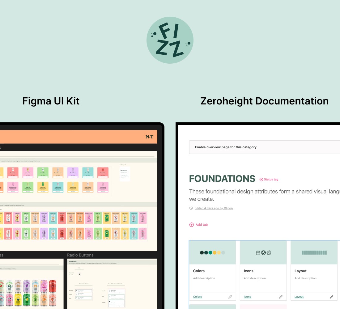
Created a Figma UI Kit with advanced components and patterns, along with foundational styles and tokens.
Created a Figma UI Kit with advanced components and patterns, along with foundational styles and tokens.
Documentation on Zeroheight
Documentation on Zeroheight
Documentation on Zeroheight
Provided useful documentation, rules and guidelines for Designers and Developers.
Provided useful documentation, rules and guidelines for Designers and Developers.




Problem
What is Olipop? Why does it need a Design System?
What is Olipop? Why does it need a Design System?
What is Olipop? Why does it need a Design System?
Olipop is a rapidly growing probiotic soda brand that combines nostalgic flavors with modern wellness, offering a healthier alternative to traditional soft drinks. Known for its vibrant, playful, and colorful design identity, Olipop appeals to a wide audience seeking both taste and health benefits. As the brand expands its reach, maintaining a consistent and accessible digital presence has become essential to support its growth.
Olipop is a rapidly growing probiotic soda brand that combines nostalgic flavors with modern wellness, offering a healthier alternative to traditional soft drinks. Known for its vibrant, playful, and colorful design identity, Olipop appeals to a wide audience seeking both taste and health benefits. As the brand expands its reach, maintaining a consistent and accessible digital presence has become essential to support its growth.
Olipop is a rapidly growing probiotic soda brand that combines nostalgic flavors with modern wellness, offering a healthier alternative to traditional soft drinks. Known for its vibrant, playful, and colorful design identity, Olipop appeals to a wide audience seeking both taste and health benefits. As the brand expands its reach, maintaining a consistent and accessible digital presence has become essential to support its growth.
Design challenges with the Current Website
Design challenges with the Current Website
Bloated inventory with lots of redundancy
Bloated inventory with lots of redundancy
Bloated inventory with lots of redundancy
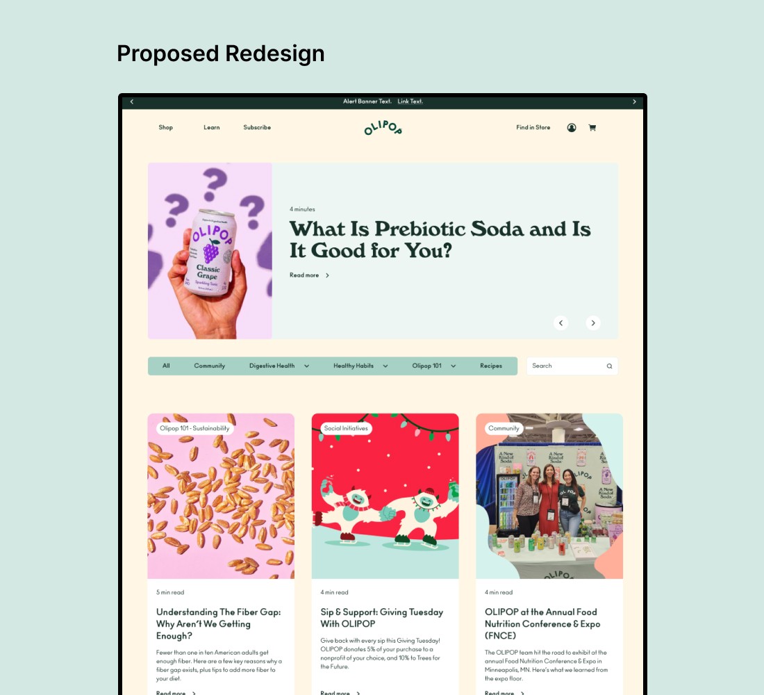
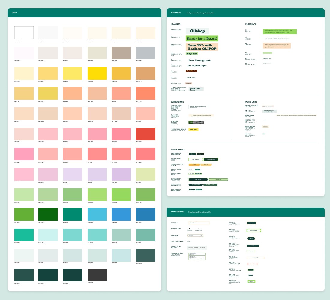
The Olipop website has more than 75 Colors, 28 text styles and 17 different button styles, that create unnecessary visual clutter and inconsistency.
The Olipop website has more than 75 Colors, 28 text styles and 17 different button styles, that create unnecessary visual clutter and inconsistency.
The Olipop website has more than 75 Colors, 28 text styles and 17 different button styles, that create unnecessary visual clutter and inconsistency.
No Clear Brand Identity
No Clear Brand Identity
No Clear Brand Identity
While visually engaging, Olipop lacks repetitive patterns, resulting in a missing visual throughline to unify its pages and establish a cohesive identity.
While visually engaging, Olipop lacks repetitive patterns, resulting in a missing visual throughline to unify its pages and establish a cohesive identity.
While visually engaging, Olipop lacks repetitive patterns, resulting in a missing visual throughline to unify its pages and establish a cohesive identity.
Usability and Accessibility issues
Usability and Accessibility issues
Usability and Accessibility issues
Some buttons and icons fell short of WCAG standards for color contrast and sizing, misaligning with Olipop's inclusive brand values.
Some buttons and icons fell short of WCAG standards for color contrast and sizing, misaligning with Olipop's inclusive brand values.
Some buttons and icons fell short of WCAG standards for color contrast and sizing, misaligning with Olipop's inclusive brand values.


Solution
How can a Design system help?
How can a Design system help?
How can a Design system help?
A Design System addresses the root cause: the lack of foundational rules and scalable design components. By doing so, we ensure future designs not only stay true to Olipop’s vibrant identity but also prioritize accessibility and functionality.
A Design System addresses the root cause: the lack of foundational rules and scalable design components. By doing so, we ensure future designs not only stay true to Olipop’s vibrant identity but also prioritize accessibility and functionality.
A Design System addresses the root cause: the lack of foundational rules and scalable design components. By doing so, we ensure future designs not only stay true to Olipop’s vibrant identity but also prioritize accessibility and functionality.
Standardization
Standardization
Standardization
By establishing a cohesive visual and functional language for all digital assets.
By establishing a cohesive visual and functional language for all digital assets.
By establishing a cohesive visual and functional language for all digital assets.
Efficiency
Efficiency
Efficiency
By streamling design and development workflows with reusable components and styles.
By streamling design and development workflows with reusable components and styles.
By streamling design and development workflows with reusable components and styles.
Accessibility
Accessibility
Accessibility
By baking WCAG compliance into the system, ensuring all designs meet accessibility standards.
By baking WCAG compliance into the system, ensuring designs meet a||y standards.
By baking WCAG compliance into the system, ensuring all designs meet accessibility standards.
Introducing Fizz
Olipop's Design System
Introducing Fizz
Olipop's Design System
Introducing Fizz
Olipop's Design System
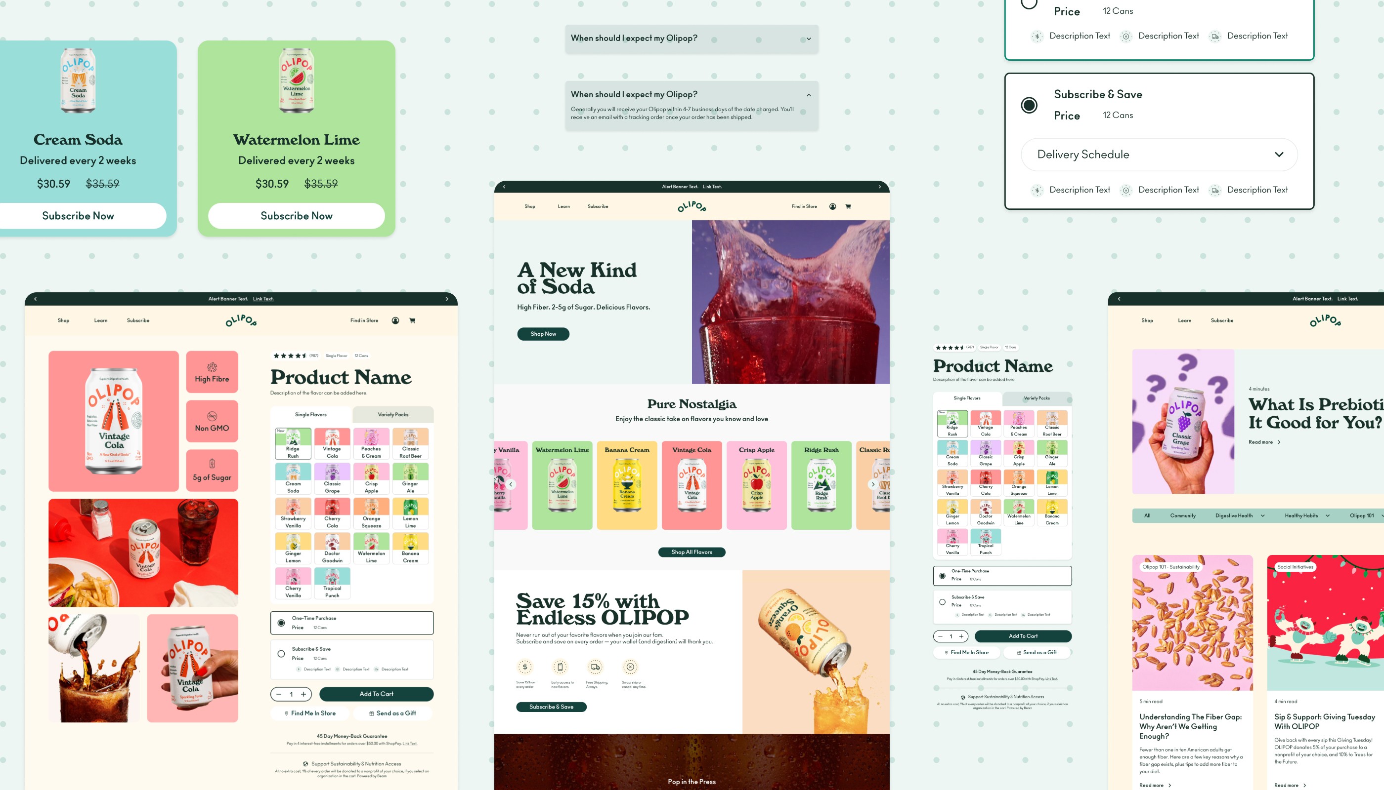
Fizz is Olipop’s design system, created to ensure a unified and delightful user experience across all digital touchpoints.
The Fizz Design system consists of:
Not sure if Fizz is right for you and your team? View our Pitch Deck here!
Fizz is Olipop’s design system, created to ensure a unified and delightful user experience across all digital touchpoints.
The Fizz Design system consists of:
Not sure if Fizz is right for you and your team? View our Pitch Deck here!
Fizz is Olipop’s design system, created to ensure a unified and delightful user experience across all digital touchpoints.
The Fizz Design system consists of:
Not sure if Fizz is right for you and your team? View our Pitch Deck here!


How did we Create the Fizz Design System?
Step 1/3
Step 1/3
Set Strong Foundations
Set Strong Foundations
Set Strong Foundations
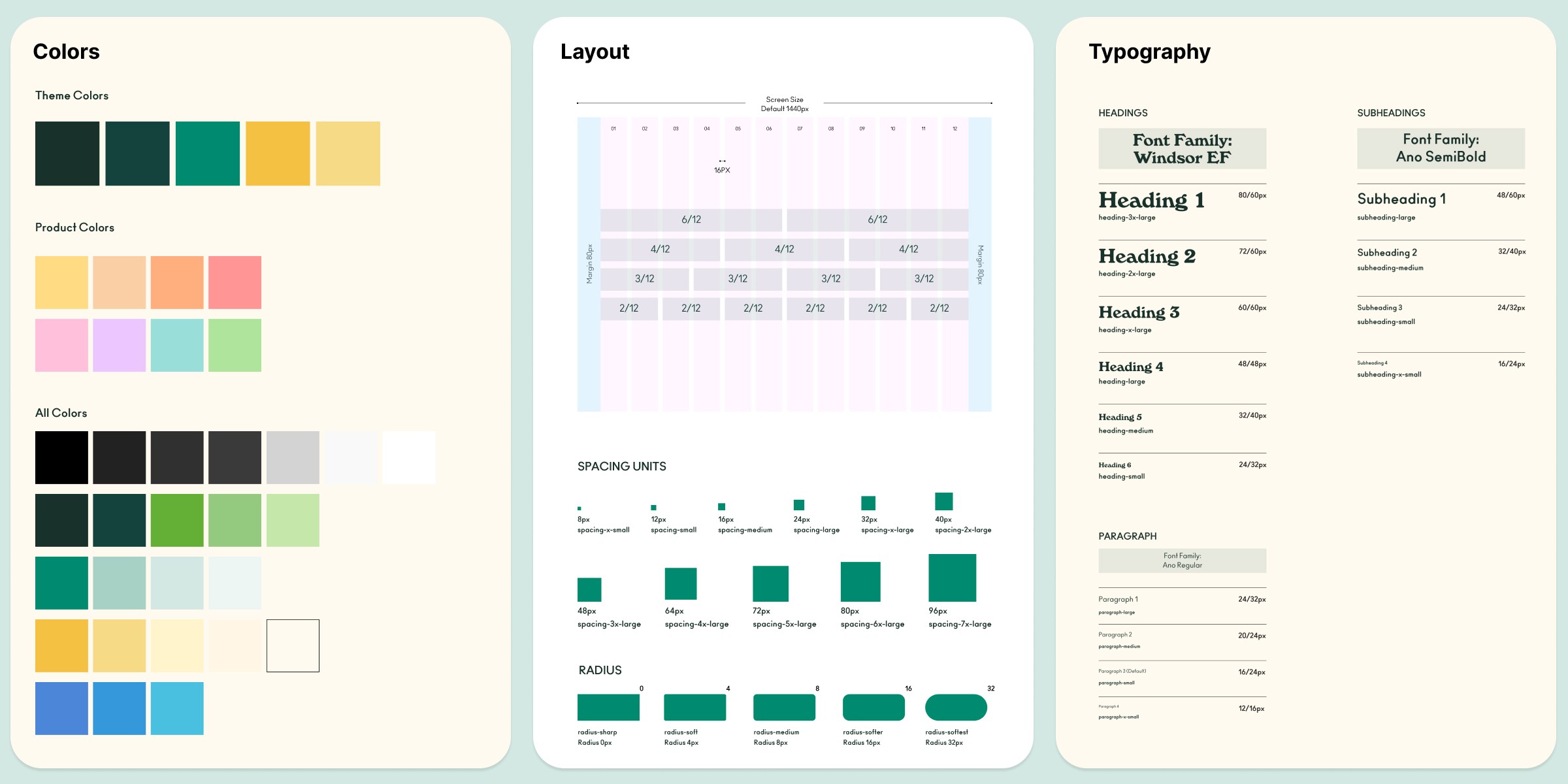
We started by establishing foundational rules and guidelines that embodied Olipop’s core values: Fun, Simplicity, and Inclusivity. These principles became the cornerstone of the design system.
Condensed Color Styles
Condensed Color Styles
Simplified the color palette, creating main theme colors as well as a streamlined 8 shades for the product flavors.
Simplified the color palette, creating main theme colors as well as a streamlined 8 shades for the product flavors.
Simplified the color palette, creating main theme colors as well as a streamlined 8 shades for the product flavors.
Foundational Elements
Foundational Elements
Ensured visual cohesiveness through a dedicated Icon library and sizing guide.
Ensured visual cohesiveness through a dedicated Icon library and sizing guide.
Ensured visual cohesiveness through a dedicated Icon library and sizing guide.
Ensured Consistent Designs
Ensured Consistent Designs
Established typography, grids, layouts, and spacing guidelines to ensure visual consistency.
Established typography, grids, layouts, and spacing guidelines to ensure visual consistency.
Established typography, grids, layouts, and spacing guidelines to ensure visual consistency.
Created Figma Tokens
Created Figma Tokens
Created tokens (primitive and semantic) to eliminate guesswork and to standardize design workflows.
Created tokens (primitive and semantic) to eliminate guesswork and to standardize design workflows.
Created tokens (primitive and semantic) to eliminate guesswork and to standardize design workflows.


Step 2/3
Created an extensive UI Library in Figma
Created an extensive UI Library in Figma
Created an extensive UI Library in Figma
We developed a comprehensive UI kit based on Brad Frost's atomic design principles, starting with smaller atoms and combining them to form more complex, reusable patterns.
Prioritized Flexibility
Prioritized Flexibility
Breaking components into smaller, reusable atoms allows designers to efficiently create and modify molecules to fit the content.
Breaking components into smaller, reusable atoms allows designers to efficiently create and modify molecules to fit the content.
Breaking components into smaller, reusable atoms allows designers to efficiently create and modify molecules to fit the content.
Streamlined repeat workflows
Streamlined repeat workflows
By identifying the most common patterns, we enabled designers to save time with drag-and-drop functionality for seamless integration.
By identifying the most common patterns, we enabled designers to save time with drag-and-drop functionality for seamless integration.
By identifying the most common patterns, we enabled designers to save time with drag-and-drop functionality for seamless integration.
The Fizz Design System has components that:
The Fizz Design System has components that:
Easily Swap between Variants
Easily Swap between Variants
Components are built with variants, allowing users to easily swap them to fit their content, saving time and enhancing flexibility.
Components are built with variants, allowing users to easily swap them to fit their content, saving time and enhancing flexibility.
Components are built with variants, allowing users to easily swap them to fit their content, saving time and enhancing flexibility.
Eliminate Guesswork
Eliminate Guesswork
By using semantic tokens for components, designers and developers can work seamlessly without guesswork.
By using semantic tokens for components, designers and developers can work seamlessly without guesswork.
By using semantic tokens for components, designers and developers can work seamlessly without guesswork.
Build Pages Quicker
Build Pages Quicker
Frequently used patterns are included in the UI kit, saving time and allowing designers to focus on creativity rather than starting from scratch.
Frequently used patterns are included in the UI kit, saving time and allowing designers to focus on creativity rather than starting from scratch.
Frequently used patterns are included in the UI kit, saving time and allowing designers to focus on creativity rather than starting from scratch.
Shreedhar Verma Portfolio
sverma6@pratt.edu
©
Shreedhar Verma 2025
Shreedhar Verma Portfolio
sverma6@pratt.edu
©
Shreedhar Verma 2025
Inclusive Design
How is Accessibility prioritized in the Fizz Design System?
How is Accessibility prioritized in the Fizz Design System?
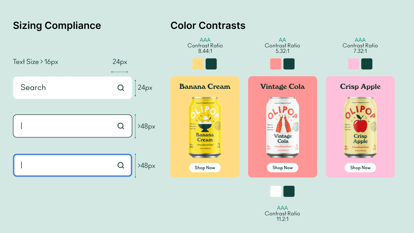
Accessibility is a core focus of the design system, reflecting Olipop’s commitment to inclusivity and its brand values. By integrating accessibility standards into every aspect of the design, we ensured that Olipop’s digital presence remains functional and welcoming for all users.
Accessibility is a core focus of the design system, reflecting Olipop’s commitment to inclusivity and its brand values. By integrating accessibility standards into every aspect of the design, we ensured that Olipop’s digital presence remains functional and welcoming for all users.
Touch Target and Text Sizes
Touch Target and Text Sizes
Developed accessible components with appropriate sizes for text and interactive elements, ensuring usability for users with vision or motor impairments.
Developed accessible components with appropriate sizes for text and interactive elements, ensuring usability for users with vision or motor impairments.
Color Contrast
Color Contrast
Ensured WCAG-compliant color contrast (AA standard, 4.5:1 or higher) across all elements, including product flavor colors, to enhance accessibility for users with low vision or color blindness.
Ensured WCAG-compliant color contrast (AA standard, 4.5:1 or higher) across all elements, including product flavor colors, to enhance accessibility for users with low vision or color blindness.
WCAG Compliance
WCAG Compliance
Included accessibility guidelines and links to WCAG documentation to support future design efforts and ensure ongoing compliance.
Included accessibility guidelines and links to WCAG documentation to support future design efforts and ensure ongoing compliance.


Step 3/3
Documented our Design System on Zeroheight
Documented our Design System on Zeroheight
Documented our Design System on Zeroheight
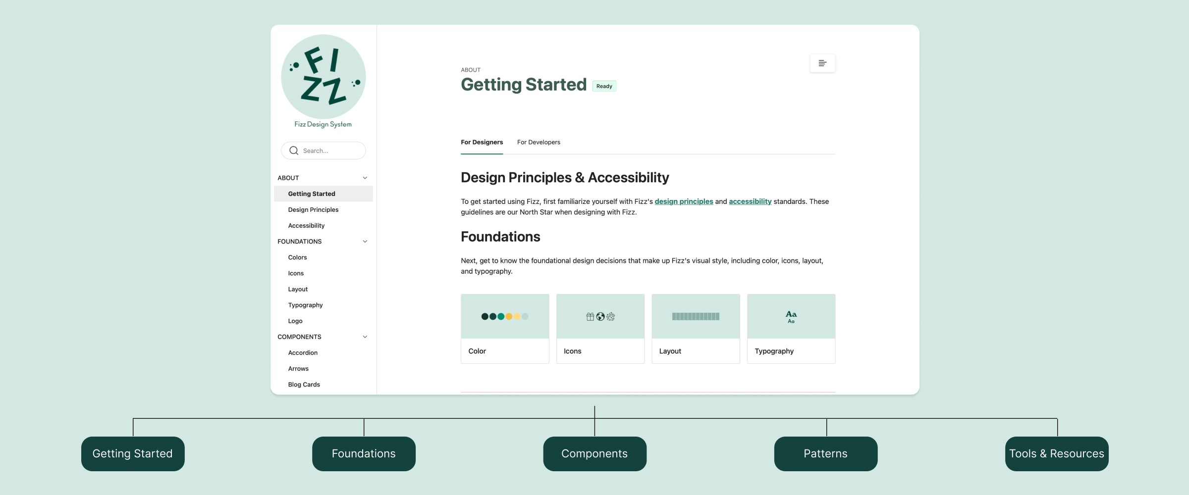
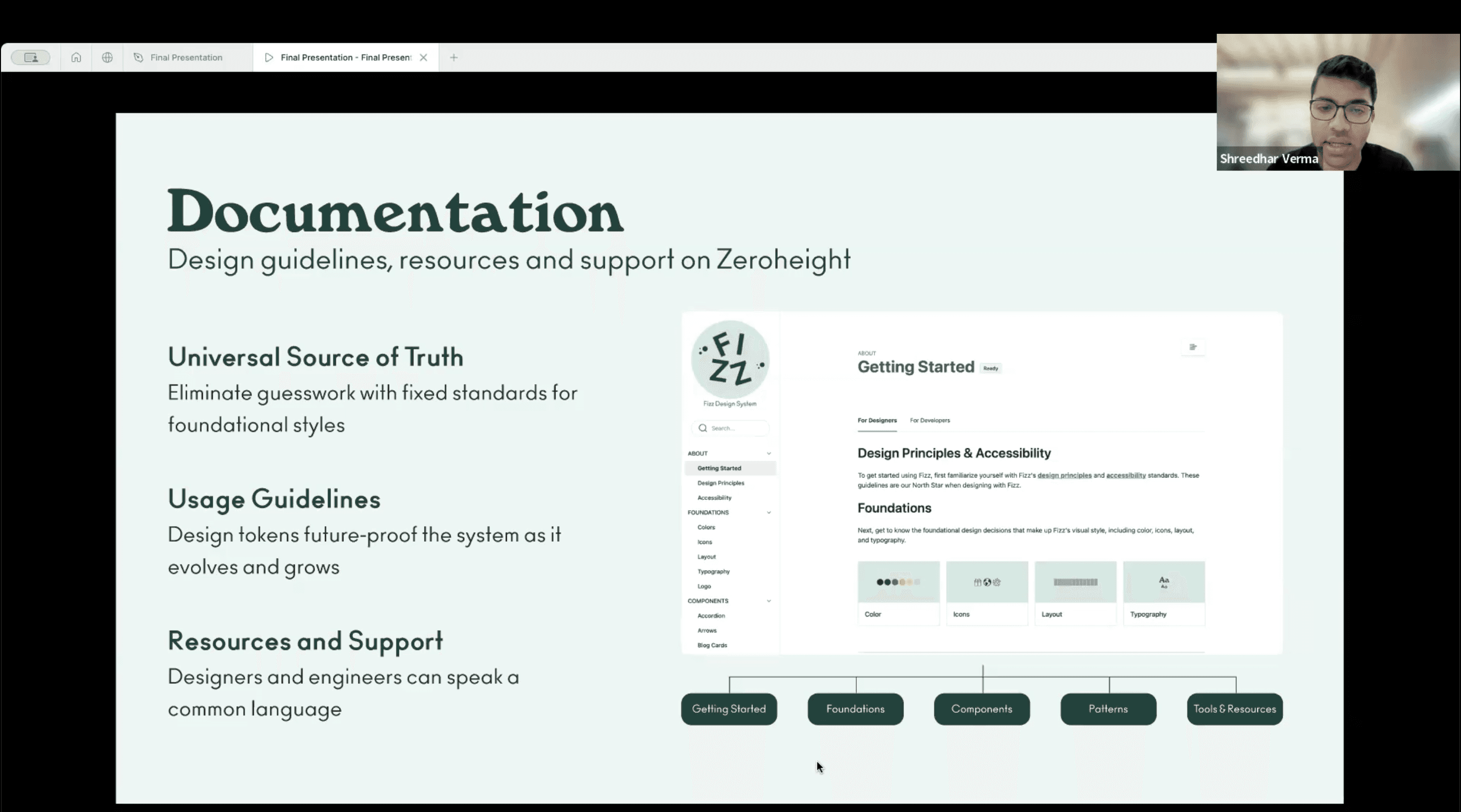
The design system and its documentation serve as a single source of truth, empowering designers, developers, and stakeholders to collaborate more efficiently while ensuring consistency with Olipop’s brand values. By hosting it on ZeroHeight, the resources are easily accessible, reducing repetitive problem-solving and streamlining onboarding for new team members.
The design system and its documentation serve as a single source of truth, empowering designers, developers, and stakeholders to collaborate more efficiently while ensuring consistency with Olipop’s brand values. By hosting it on ZeroHeight, the resources are easily accessible, reducing repetitive problem-solving and streamlining onboarding for new team members.
The design system and its documentation serve as a single source of truth, empowering designers, developers, and stakeholders to collaborate more efficiently while ensuring consistency with Olipop’s brand values. By hosting it on ZeroHeight, the resources are easily accessible, reducing repetitive problem-solving and streamlining onboarding for new team members.


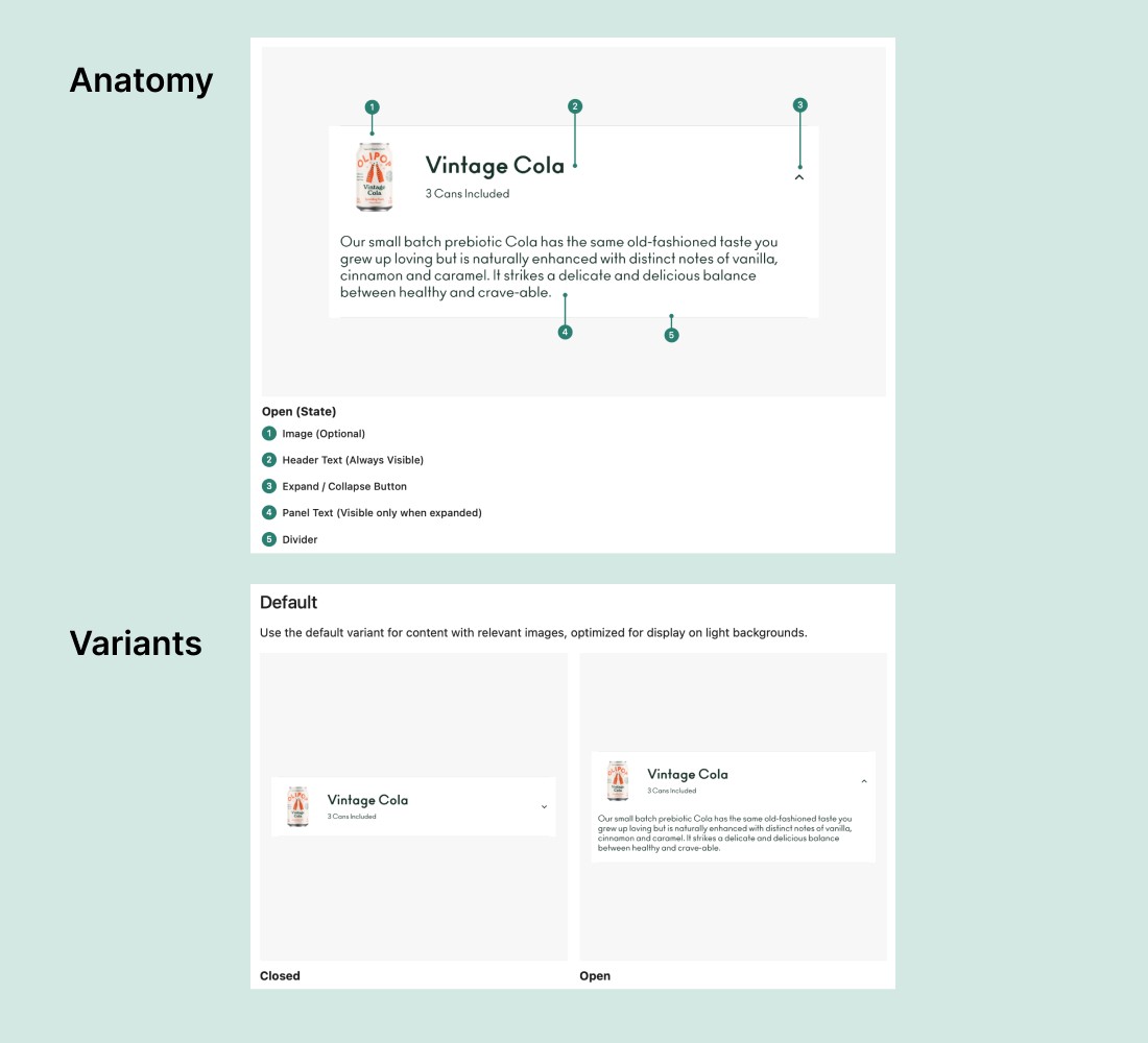
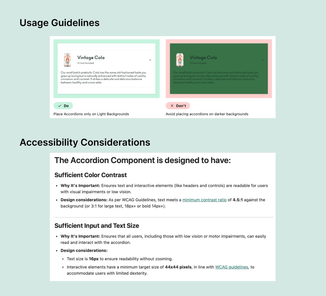
Documentation for each component
Each component is accompanied by detailed documentation that outlines its anatomy (essential vs. optional parts), variant states, usage guidelines with do's and don'ts, and accessibility considerations to support informed and inclusive design decisions. This ensures both designers and developers have clear guidance on the optimal use of components for various scenarios.
Each component is accompanied by detailed documentation that outlines its anatomy (essential vs. optional parts), variant states, usage guidelines with do's and don'ts, and accessibility considerations to support informed and inclusive design decisions. This ensures both designers and developers have clear guidance on the optimal use of components for various scenarios.




What value does the Design system create?
What value does the Design system create?
A common challenge in adopting design systems is the perception that they primarily benefit designers. However, the true value of a design system emerges when everyone—designers, developers, and stakeholders—align around a single source of truth, fostering collaboration, consistency, and efficiency.
A common challenge in adopting design systems is the perception that they primarily benefit designers. However, the true value of a design system emerges when everyone—designers, developers, and stakeholders—align around a single source of truth, fostering collaboration, consistency, and efficiency.
A common challenge in adopting design systems is the perception that they primarily benefit designers. However, the true value of a design system emerges when everyone—designers, developers, and stakeholders—align around a single source of truth, fostering collaboration, consistency, and efficiency.
For Designers
For Designers
For Designers
Offers clear guidelines and reusable components to streamline workflows for both existing and new team members.
Offers clear guidelines and reusable components to streamline workflows for both existing and new team members.
Offers clear guidelines and reusable components to streamline workflows for both existing and new team members.
For Developers
For Developers
For Developers
Provides standardized tokens and documentation to simplify collaboration with designers and implementation.
Provides standardized tokens and writing to simplify collaboration with designers and to implement.
Provides standardized tokens and documentation to simplify collaboration with designers and implementation.
For Stakeholders
For Stakeholders
For Stakeholders
Ensures brand values, consistency and alignment across all designs, supporting strategic goals.
Ensures brand values, consistency and alignment across all designs, supporting strategic goals.
Ensures brand values, consistency and alignment across all designs, supporting strategic goals.

Conclusions and Takeaways
Conclusions and Takeaways
Working on the Olipop design system deepened my understanding of creating scalable design solutions while honing my skills in Figma components, variables, and advanced prototyping. I also gained valuable insights into the importance of design tokens, accessibility, and cross-functional collaboration in building systems that benefit both teams and users.
Working on the Olipop design system deepened my understanding of creating scalable design solutions while honing my skills in Figma components, variables, and advanced prototyping. I also gained valuable insights into the importance of design tokens, accessibility, and cross-functional collaboration in building systems that benefit both teams and users.
Working on the Olipop design system deepened my understanding of creating scalable design solutions while honing my skills in Figma components, variables, and advanced prototyping. I also gained valuable insights into the importance of design tokens, accessibility, and cross-functional collaboration in building systems that benefit both teams and users.
Positives & Strengths
Positives & Strengths
Positives & Strengths
I upskilled in creating Figma components, using variables, and building advanced prototypes, while also learning how design tokens benefit both designers and developers.
I upskilled in creating Figma components, using variables, and building advanced prototypes, while also learning how design tokens benefit both designers and developers.
I upskilled in creating Figma components, using variables, and building advanced prototypes, while also learning how design tokens benefit both designers and developers.
Possible Next Steps
Possible Next Steps
Possible Next Steps
To conduct user research to evaluate the effectiveness of the content on Olipop's website, enabling me to develop a holistic design proposal alongside the design system.
To conduct user research to evaluate the effectiveness of the content on Olipop's website, enabling me to develop a holistic design proposal alongside the design system.
To conduct user research to evaluate the effectiveness of the content on Olipop's website, enabling me to develop a holistic design proposal alongside the design system.
My takeaway
My takeaway
My takeaway
Having a universal source of truth cuts down on repetitive work and helps bring designers, PM's, and developers onto the same page, making collaboration smoother and more efficient.
Having a universal source of truth cuts down on repetitive work and helps bring designers, PM's, and developers onto the same page, making collaboration smoother and more efficient.
Having a universal source of truth cuts down on repetitive work and helps bring designers, PM's, and developers onto the same page, making collaboration smoother and more efficient.
Project Highlights!
Project Highlights!


User Testing our Figma UI Kit
We conducted usability testing of our UI Kit with other designers to evaluate how effectively they could navigate the kit to locate assets, customize components, and construct pages efficiently.


Delivering our Pitch
We pitched the Fizz design system to a mock panel of designers, developers, and stakeholders, delivering a compelling value statement to showcase its impact and benefits.
More Projects —
Shreedhar Verma Portfolio
sverma6@pratt.edu
©
Shreedhar Verma 2025
Shreedhar Verma Portfolio
sverma6@pratt.edu
©
Shreedhar Verma 2025


